EASEL OF Seth Rutledge
2
You must be logged in to critique
CRITFeedback for Image 2
-
 Genbu on August 7, 2018 at 3:05 pm
Looks really neat! One little thing is this could use some more clutter or I think they’re call environment fluff?
Log in to Reply
1
Chop Shop
You must be logged in to critique
CRITFeedback for Image 1
-
 Genbu on August 1, 2018 at 8:34 pm
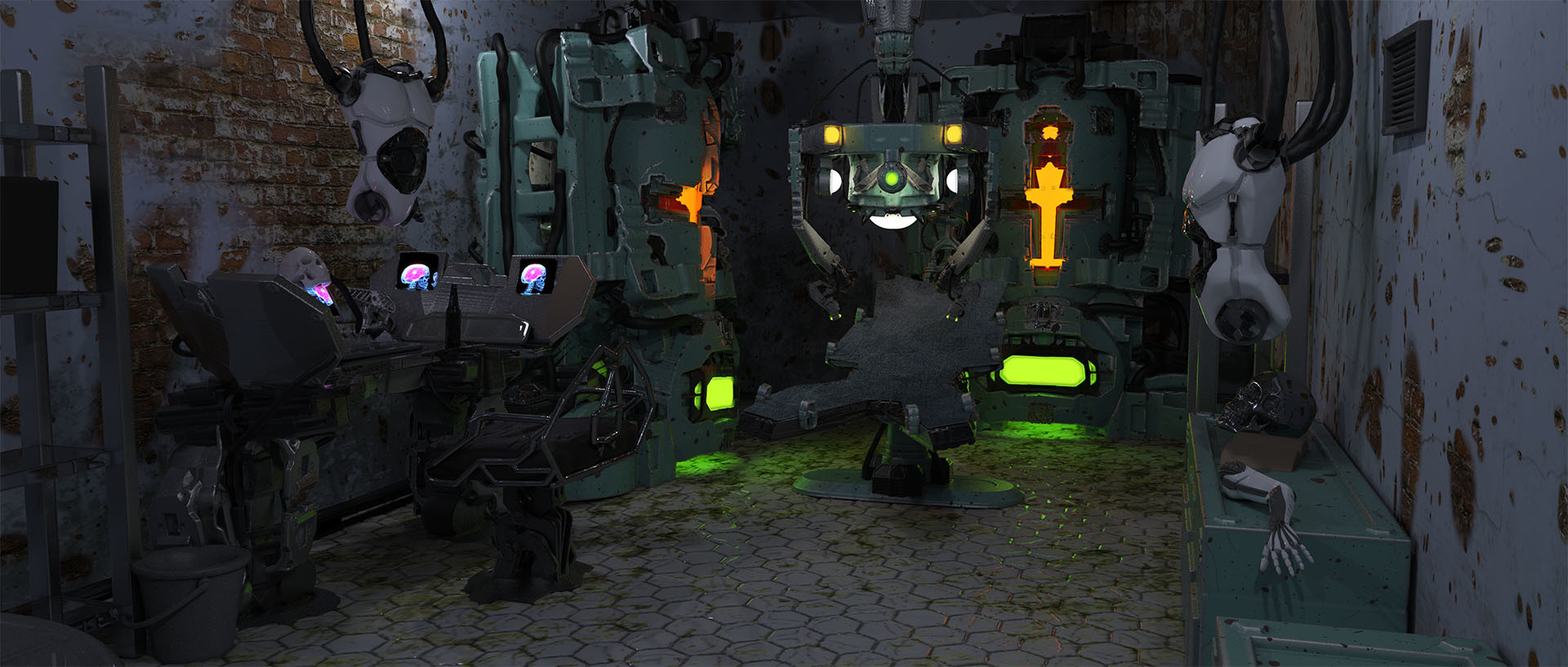
This is pretty amazing that you can make all this entirely in Oculus. I am not knowledgeable in 3D or VR, so my 2 cents will be more on the concept side.
Expand this image by making more sheets – what is this a concept of? Whether if for a game or a film or a short commercial, the camera will likely pan beyond this position. Concept design needs to show the bigger idea behind a scene.
Log in to Reply -
 AdrianNagorski on August 2, 2018 at 4:56 am
Nice scene,
Log in to Reply
the floor and the wall colors might be too similar
those yellow furnaces catch my eyes attention immediately
-have you considered floating dust particles in the room? or smoke from the yellow things?
the control panel on the left and table in the middle of the room seem to disappear in the scene
its either their color of value or perhaps lack of detail?
i think you need to focus on a focal point otherwise things just get lost in the scene?-
 Genbu on August 2, 2018 at 8:19 am
Actually I thought the focal point is clear here, at the glowing things in the back. It’s the form that don’t read very well to me unless I take a hard look for a few – then I can distinguish the claw and operating table from those glowing furnace that they’re separate and not attached.
Log in to Reply-
 eldritch48 on August 7, 2018 at 12:16 pm
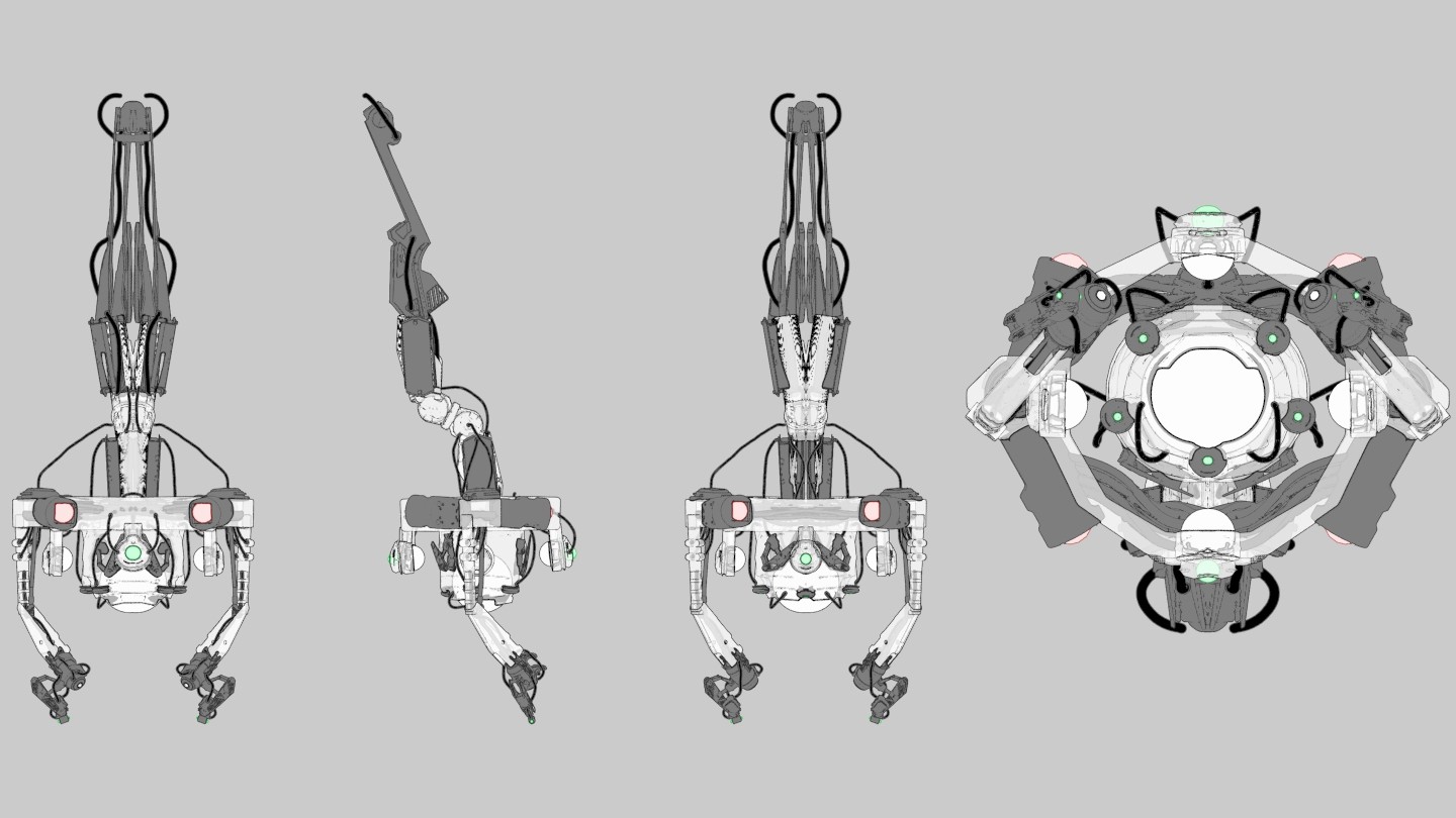
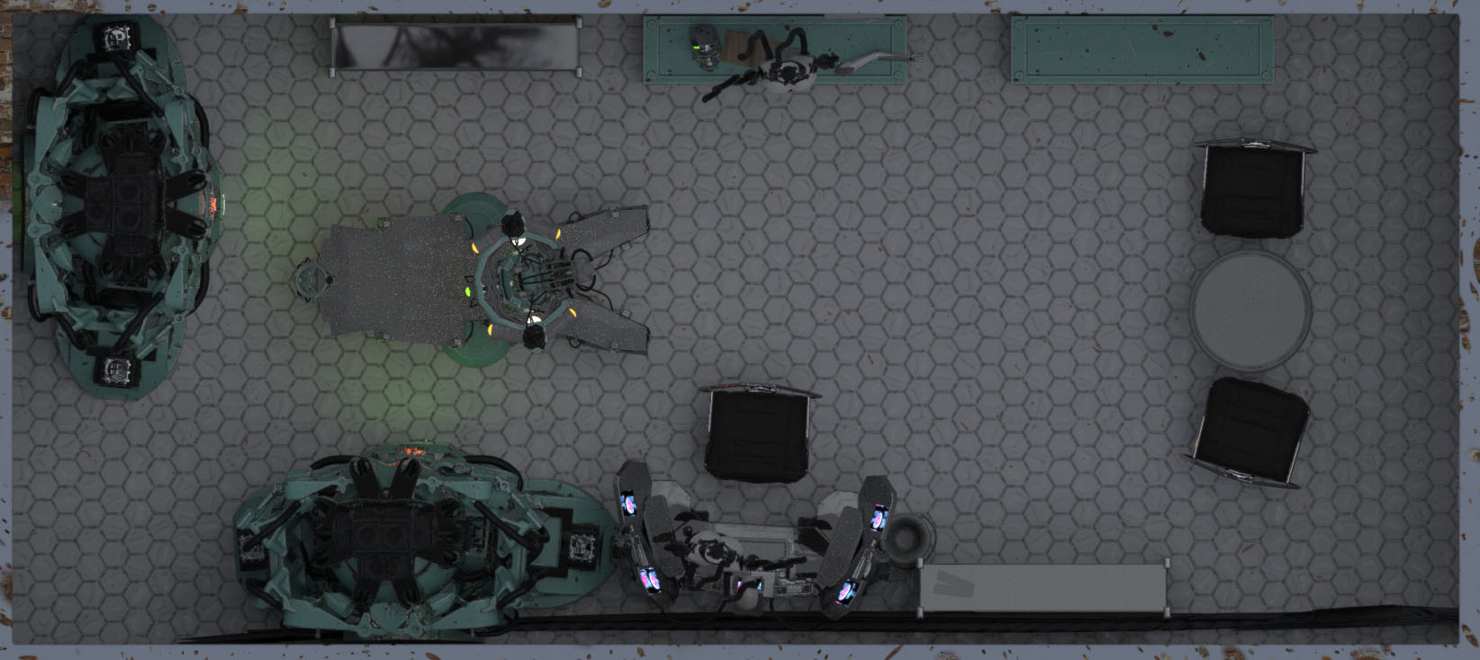
Totally 🙂 I have individual design pages for each piece, but I can only upload 3 images to the site.
Log in to Reply
-
-
-
 KohseArt on September 28, 2018 at 2:22 pm
Looking good overall. A couple things I would do.
Log in to Reply
– Move the lighting away from the wall behind the figure on the left and focus it on the figure. This should also highlight the workstation better and give me something other than a furnace and a wall to focus on.
– The light above the operating table does not light up the operating table enough. It was totally lost in the background and took a while to to realize it was there. Maybe even add a figure almost fully assembled on the table.
– Details. With the sloppiness of the workshop, I would expect to see something on the floor. There is grunge which tells me it does not get cleaned well but yet other than stained tiles, there is nothing on the floor. No piles of parts from overfilled shelves or dropped tablets. No clipped wires or dropped tools… come to think of it, there are no tools actually. You have a workbench and haphazardly placed arm on the right but no tools or screws or parts laying around. The shiny tiles look out of place in the middle of the room.
Seth Rutledge
I am a dual-citizen of the United States and Canada, working as a concept artist, illustrator, and visual development artist specializing in environment art.
I am open to critique
I WOULD LIKE HELP WITH
I made this entirely in 3D with Oculus Medium for modeling and Keyshot for lighting and rendering. I'd love to push it further as concept art.


Yeah! This is super! What’s that on the far right? Top down view?