EASEL OF Sal V Cloak
I am open to critique
I WOULD LIKE HELP WITH
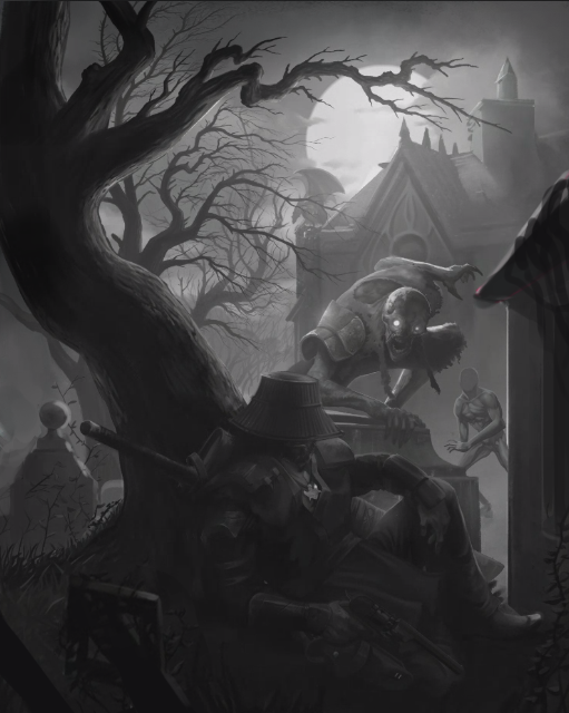
Value checks, working on figuring out how to add to the threats in the background, the emphasis is on the narrative that the attackers think the protagonist is sleeping as they close in to eat him, with the payoff being when the viewer realizes he's getting his shooter ready.


Very nice composition, I think making a blood moon for the moon might help with the sense of danger.
Great. Thanks @Hope. I’ll consider that into the lighting 🙂 Even a tinge of red in contrast to blues on this side of the camera 🙂
oh wow, so great!) Really like it a lot) Maybe few words on the composition – doesn’t there too much going on on the right side of the image an left is quite empty?) I’m not sure about the head of the character in the center of the image also. May be it’s better to move it to the left a little bit? Put it by the rule of thirds? I tried to explain it better with the drawing)))
I like how you changed the tilt of the main monster’s head so that he’s actually looking at the foreground character — I was going to suggest this same little change!
I think you need more light on the foreground figure at the foot of the tree, and the grave markers. This will round out the composition and make the story more clear.
This is looking really good so far! I don’t have much suggestion-wise at the moment (I love the subtle textures of the plants/branches and the trunk of the closest tree!)
My only nitpick would maybe to be to turn the head of the creature with the glowing eyes slightly. Just shift it to our lefthand side, so that he’s looking more directly at the guy ‘resting’ under the tree. I think it’ll help there feel like there’s more of a connection with the action that’s about to happen.
Otherwise, the values look awesome! Good job so far and I’ll be excited to see where this goes!