EASEL OF Anthony Schmidt


2
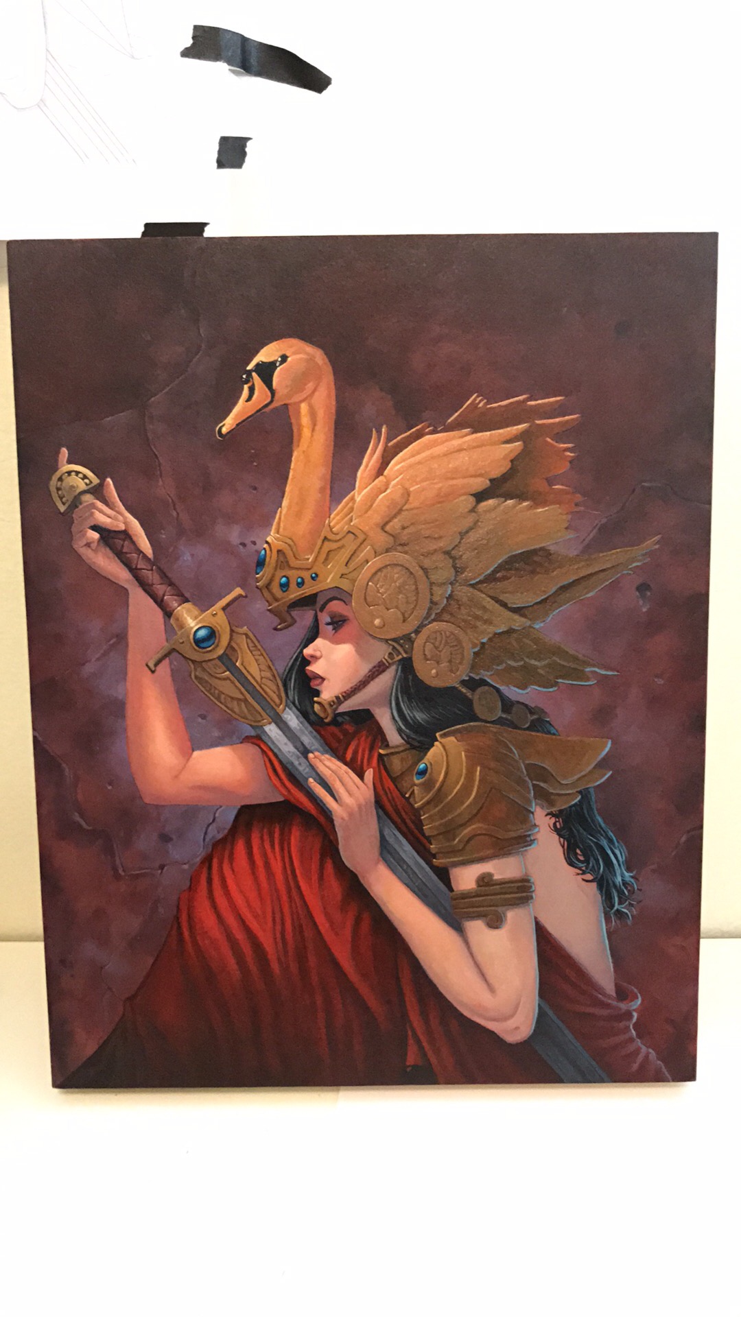
The Eidolon of the Sword
You must be logged in to critique
CRITFeedback for Image 2
-
 Dustinb on August 2, 2018 at 9:58 am
Hi Tony. This is great! For this Image I really like the ambiance, but I think the character would pop out a little more if the back ground was a little cooler/blue-er. Maybe a touch more light on the sword to match the bounce light on her face, like on the swan. Thanks for sharing, do you work with an art director?
Log in to Reply-
BeyondEmpyreanSkies on August 3, 2018 at 1:40 am
Thanks Dustin! Yeah, I agree with all your comments. I painted this in watercolor, so there was really only so far I could take it before the paint just starts lifting up. But I’ve recently started doing a finishing layer in oils, so I think I’ll try going back in with the oils to make some adjustments.
I don’t have an art director that I work with right now. I’ve been working mainly on my own IP, so I haven’t really been chasing down art directors lately. Lol
Log in to Reply-
 Dustinb on August 3, 2018 at 11:22 pm
Extra kudos for watercolor!
Log in to Reply
-
-
-
 AlSirois on August 2, 2018 at 9:36 pm
Good composition, and you move the viewer’s eye through the painting quite well. Yur technique is smooth and appealing, and there is nice attention paid to details. The hands are particularly well done. I also think the background could be a little darker, or cooler, to make the figure pop a bit more. Other than that, this is really well done.
Log in to Reply -
 mpMann on August 13, 2018 at 12:45 pm
This one is the easiest of the three to read because the orientation is correct. Its an appealing picture and I note that you are getting some warm and cool notes into the flesh. Don’t hesitate to bring them into the costuming as well. I am on table 16, don’t hesitate to swing by.
Log in to Reply
1
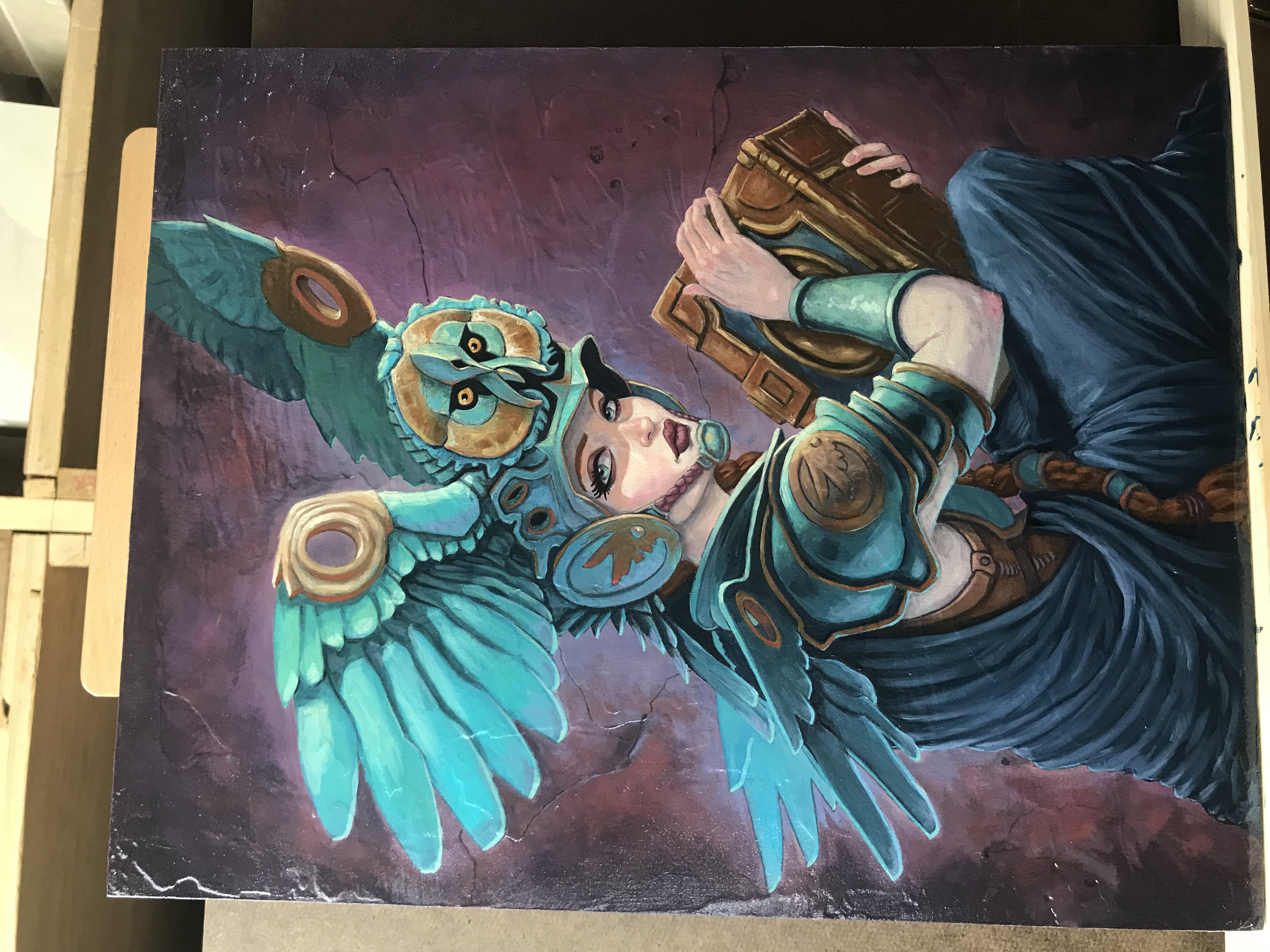
The Eidolon of Wisdom
You must be logged in to critique
CRITFeedback for Image 1
-
wblomstrom on August 2, 2018 at 7:06 am
Hi Tony,
Log in to Reply
First, I really like all your pictures here.
The only thing I could critique would be that I find that the Owl helmet doesn’t line up with her face, but just slightly. -
 AlSirois on August 2, 2018 at 9:42 pm
Again, I wish this was rotated 90 degrees for easier viewing. That said, this is another great image. I like your color sense. I love that crazy helmet. Great work on the draping. I do think, though, that the color and texture on her arm are off, but aside from that this is very well executed.
Log in to Reply-
BeyondEmpyreanSkies on August 3, 2018 at 12:56 am
Thanks! I’m not sure why you’re seeing it turned 90. It right on my device. Maybe it’s because I uploaded it from my phone?
Log in to Reply
-
Anthony Schmidt
Tony is a fantasy and sci-fi illustrator and writer who currently makes a living as a caricature artist.
I am open to critique
I WOULD LIKE HELP WITH
These are a few of my most recent works


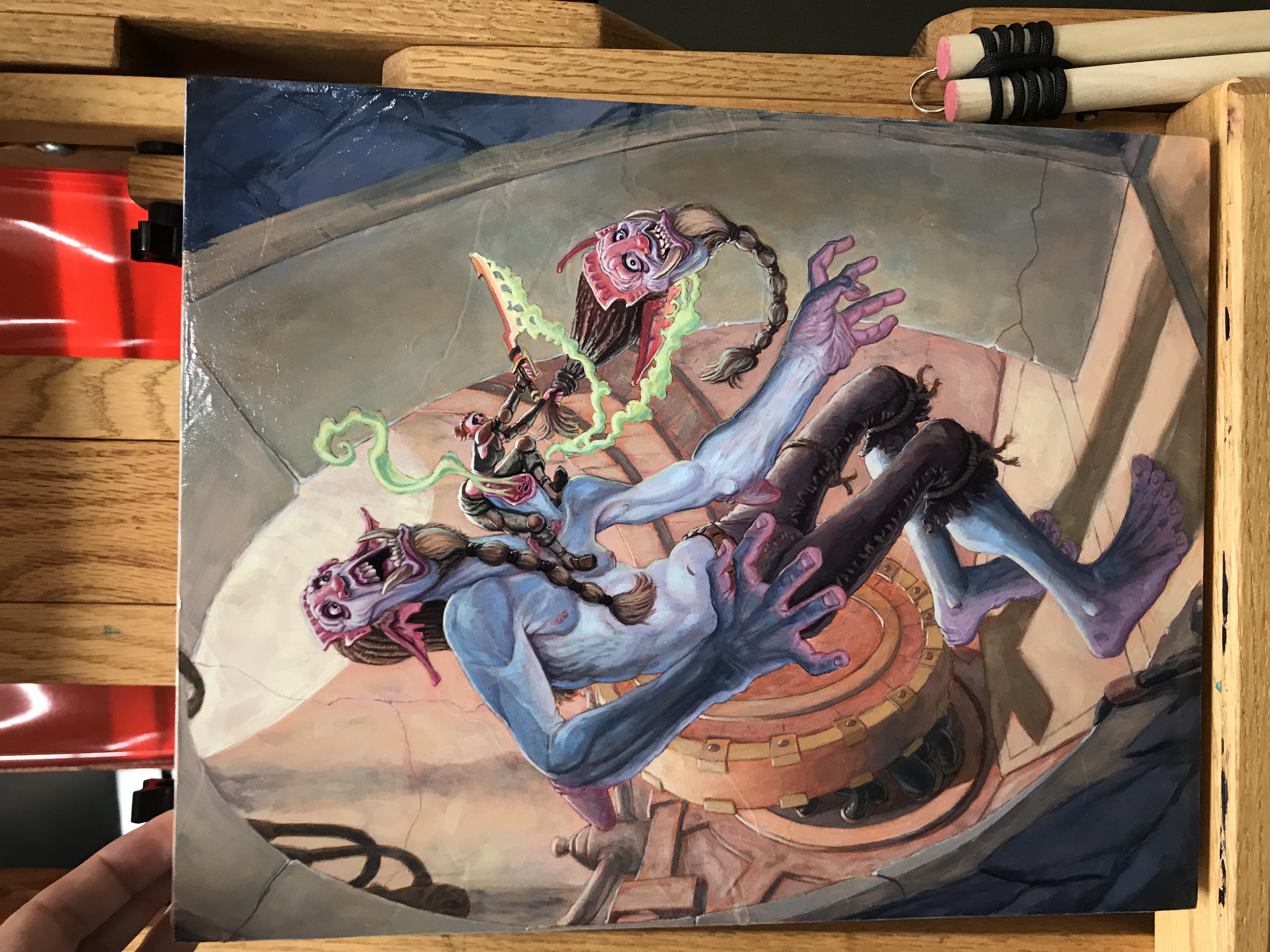
I have a little trouble seeing this because it’s on its side. I wish you would rotate it 90 degrees so we could get the full impact. The figure work here is quite good, and you’ve managed to make a complicated layout work for you with all the circles in the background providing focus on the figures. I don’t know that you need all the green goo. It seems to take away some of the impact of the figures, whose faces are so expressive that I want more focus on them. Nice work!