EASEL OF Ellen Edgerton
I am open to critique
I WOULD LIKE HELP WITH
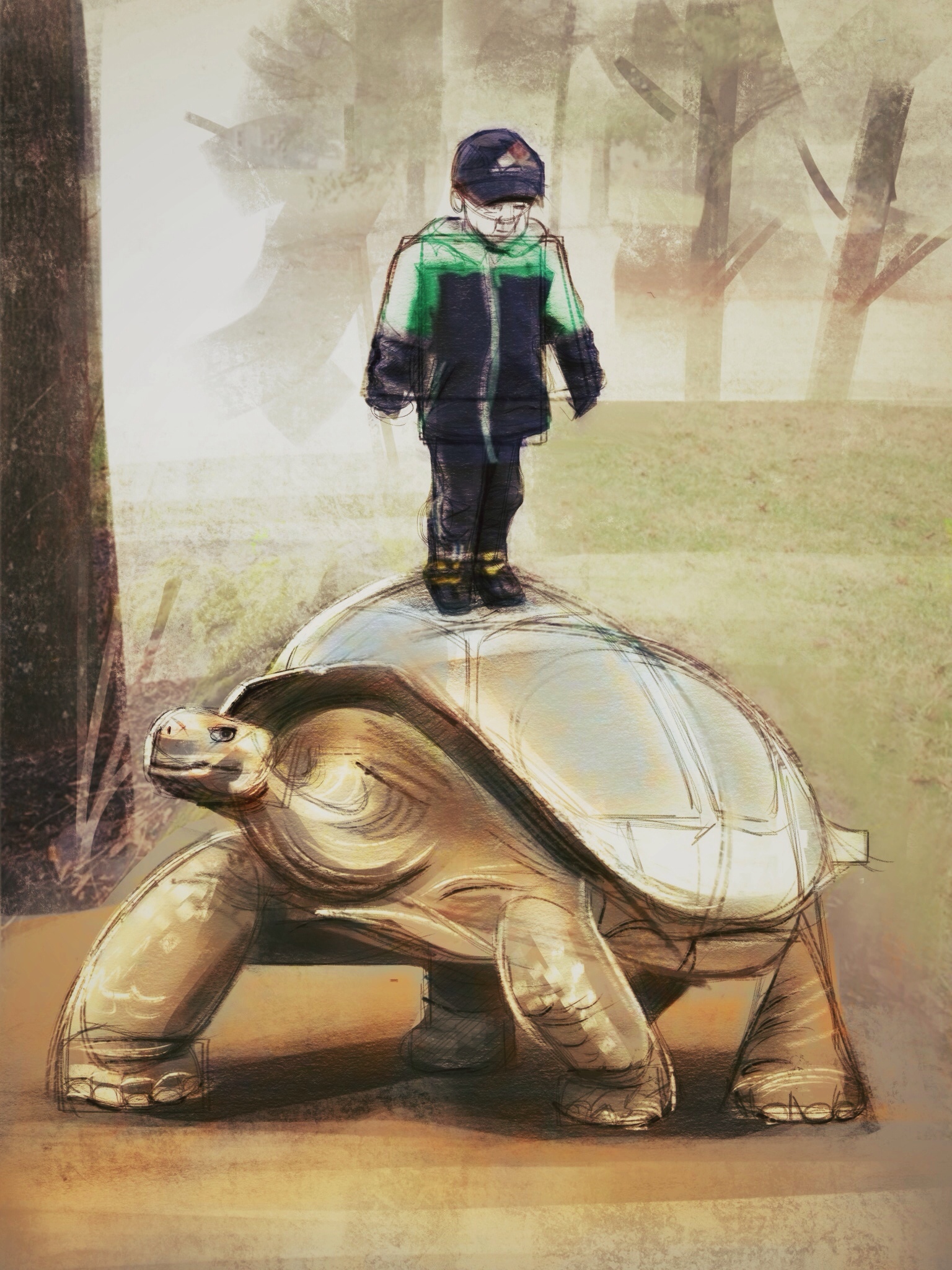
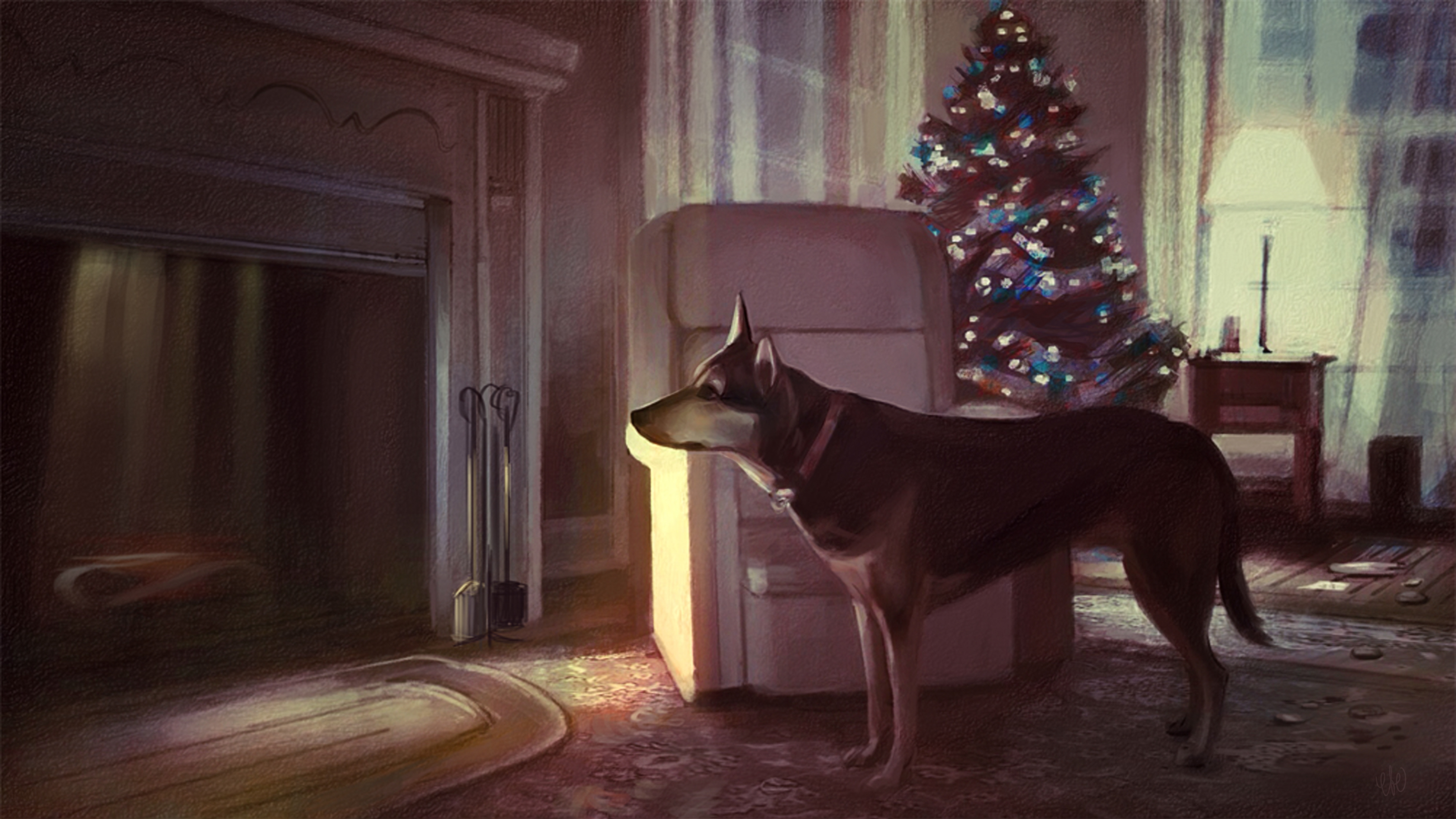
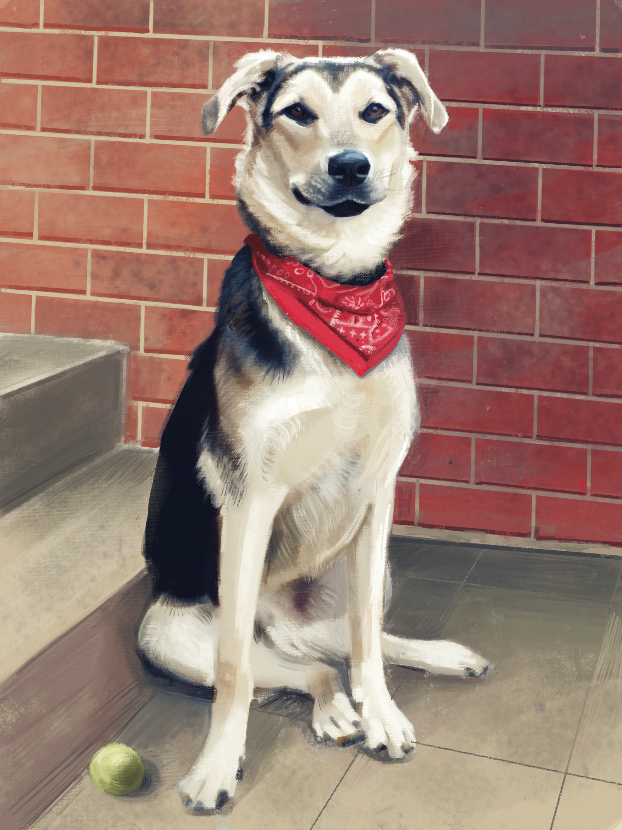
I feel as if these pictures could use "a little more" somehow... (or less?) I guess more to the point, I wonder if there even is a market for "realistic" animal-themed illustrations any more...?


There could be more of a connection between the child and tortoise if they were facing the same way, I think. Unless there is a strong story reason for the child to be facing differently?
The turtle looks great! It stands out to me though that the turtle and the little boy are on two different planes. You could get away with this in the upper body of the boy IF he had his feet to account for the imbalance, like having one foot forward and lower on the shell, like he was leaning forward. As is, he looks like he’s leaning forward to jump off, except his actual body language doesn’t agree with that, making him look like he’s not connected with the turtle and scene around him.