EASEL OF Nick Beatrice


3
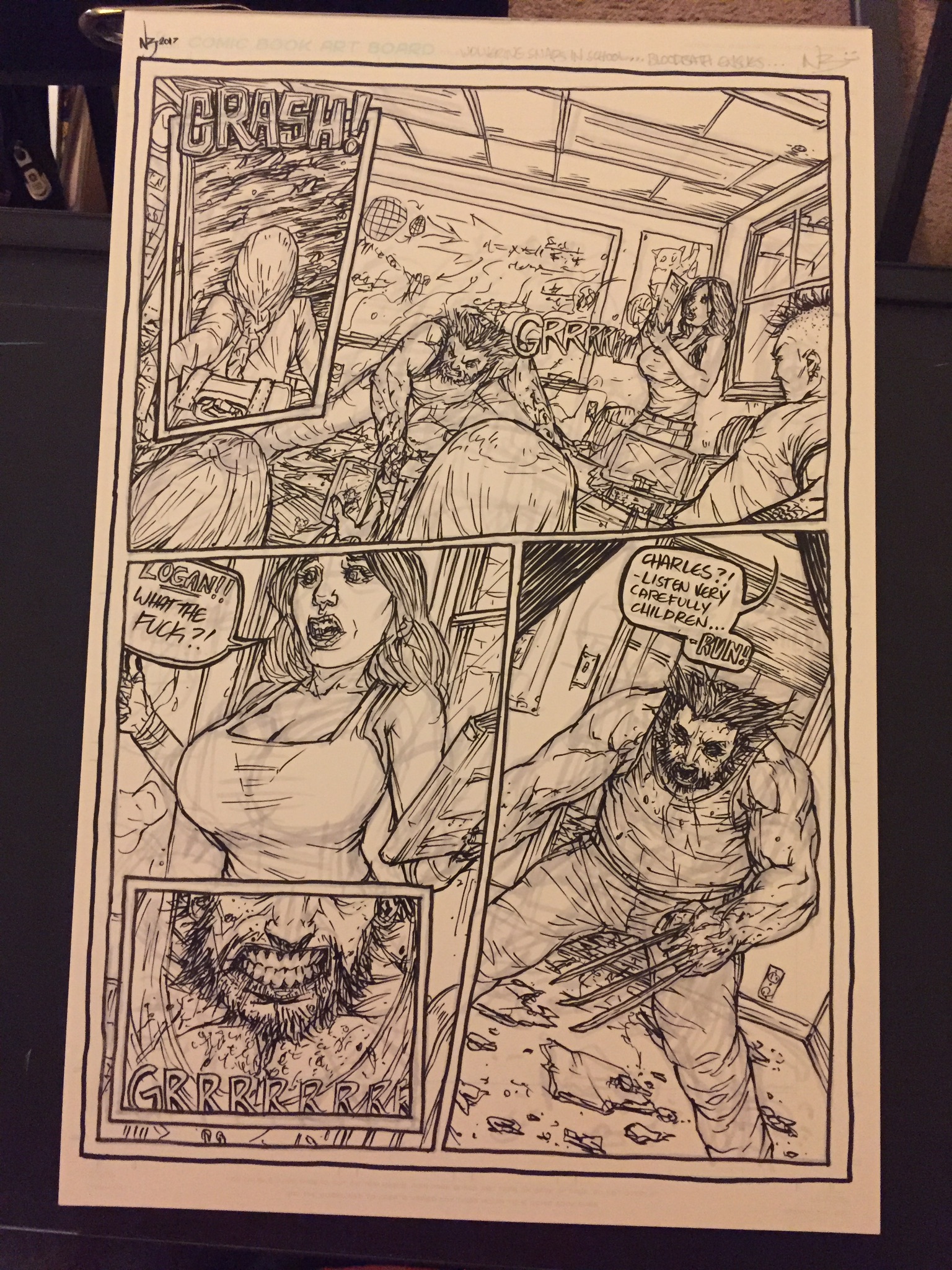
Im sorry for the horrible quality of these shots!! I just wanted to get the last seat on this table!! This last page is just me trying to go for a typical marvel style page... and is honestly my least favorite... i think i much prefer creating my own story someday and trying to self publish. If i can! But id love any feed back anyone has!! And i promise i will upload better quality stuff shortly! (Im currently on my phone!)
You must be logged in to critique
CRITFeedback for Image 3
2
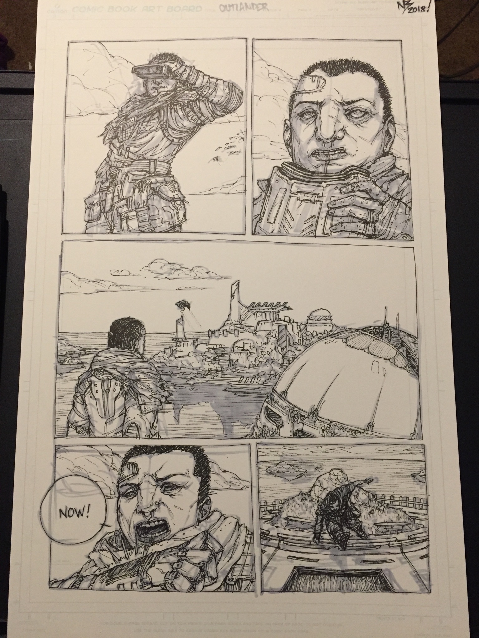
This is the opening page to a futuristic story about a group of mercenaries infiltrating a heavily fortified vacation spot of some very seedy galactic merchants.
You must be logged in to critique
CRITFeedback for Image 2
-
 mpMann on August 3, 2018 at 1:01 pm
-
NickyBeats on August 3, 2018 at 9:19 pm
Hey thanks!! I appreciate it 🙂
Log in to Reply
-
1
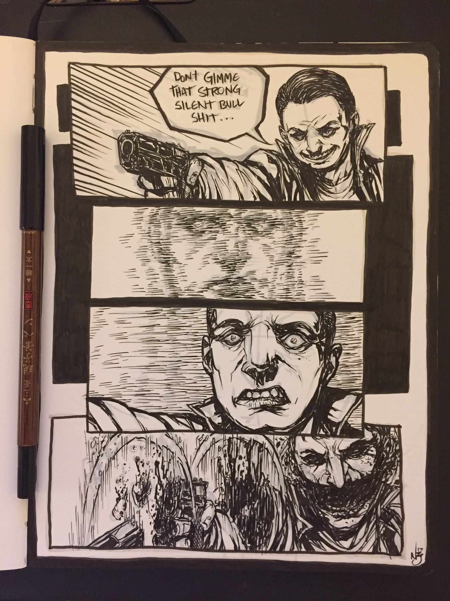
This was fun to do, i forget what inspired it, but i was focused on motion of the attack being a blur and this guy basically being sliced to ribbons before we ever see the enemy.
You must be logged in to critique
CRITFeedback for Image 1
-
 mpMann on August 3, 2018 at 1:00 pm
I see some minor alignment issues with the close up in panel three. I get the sense from the shape of his face that he should be looking off the readers left shoulder as in panel 1, but his nose is pointed straight at us. Additionally, the eyes are noticeably out of alignment.
Log in to Reply-
NickyBeats on August 3, 2018 at 9:17 pm
Hey man! Thanks for taking the time to look at these! 😀 i absolutely agree with the eye issue!! I have a terrible terrible habit of rushing my inks once i get the light block in done! I think its one of the stages that keeps my attention long enough to complete a page. So the eyes are totally lopsided, the direction of the face didnt bug me personally too much because i wanted it to zoom in on his shock, but i see what you mean! Thank you very much for dropping by!
Log in to Reply
-
-
 Dan dos Santos on August 5, 2018 at 11:46 am
The last panel didn’t quite read correctly to me. I thought it was a different person at first. When you’re trying to show a sequence of events, there needs to be more relationship between the action and non-action that precedes it. (Does that make any sense?)
For instance, I would probably make ‘Panel 4’ match ‘Panel 1’ EXACTLY in cropping and scale. That way we understand the correlation. I would also zoom in way more on ‘Panel 3’ so we get his response without ruining that correlation. Currently, ‘Panel 3’ is zoomed in just a tiny more than ‘panel 4’, so it confuses my eye.
Think of it like a movie. If the camera was pointed at the guy with the gun, would the camera be zoomed out for #1, zoom in just a bit for #3, and then zoom back out a little for #4? No, it would look weird to just zoom in and out for no reason. They may cut to an extreme closeup though.
I’m seeing some of the correlation problems in your Wolverine page too. I’m having trouble understand where the action is coming from and how it relates to the panel before it.
Log in to Reply-
NickyBeats on August 6, 2018 at 10:12 pm
Thanks Dan! Its funny, when you relate it to a film, i do really see what you mean. That would be horrible direction and framing.
I try to not spend too long on the layout of the panel and utterly pay for it later! I really just need to learn concentration better because i always lose patience setting up the underlying structure of the scenes, like composition and more importantly perspective. But i guess it really is more of a waste of time to rush to the fun part without taking time to examine everything better.
I have a big issue with consistency. Both in style and substance i can go all over the place. Also i make excuse thinking ok well i can get a bit flexible because look how much Ashley Wood changes his style in his sequential work…
But i think i need to just really put in the prep work and think about set up/ pacing a bit more!
Thanks a lot for taking time to not only look at this, but to write an honest and helpful critique!!
Log in to Reply
-
Nick Beatrice
Aspiring comic artist looking to one day self publish! I love comics, manga, anime, basically anything that is creative, original, and tells an interesting story! I am very open to critiques on my stuff and have a thick skin! So dont hold back!
I am open to critique
I WOULD LIKE HELP WITH
Looking for any crits you might have! I want to someday self publish a story of my own, hopefully in print but would settle for at least something complete on the web. Thanks for looking!!


I like the character design.