EASEL OF Briana Mora
I am open to critique
I WOULD LIKE HELP WITH
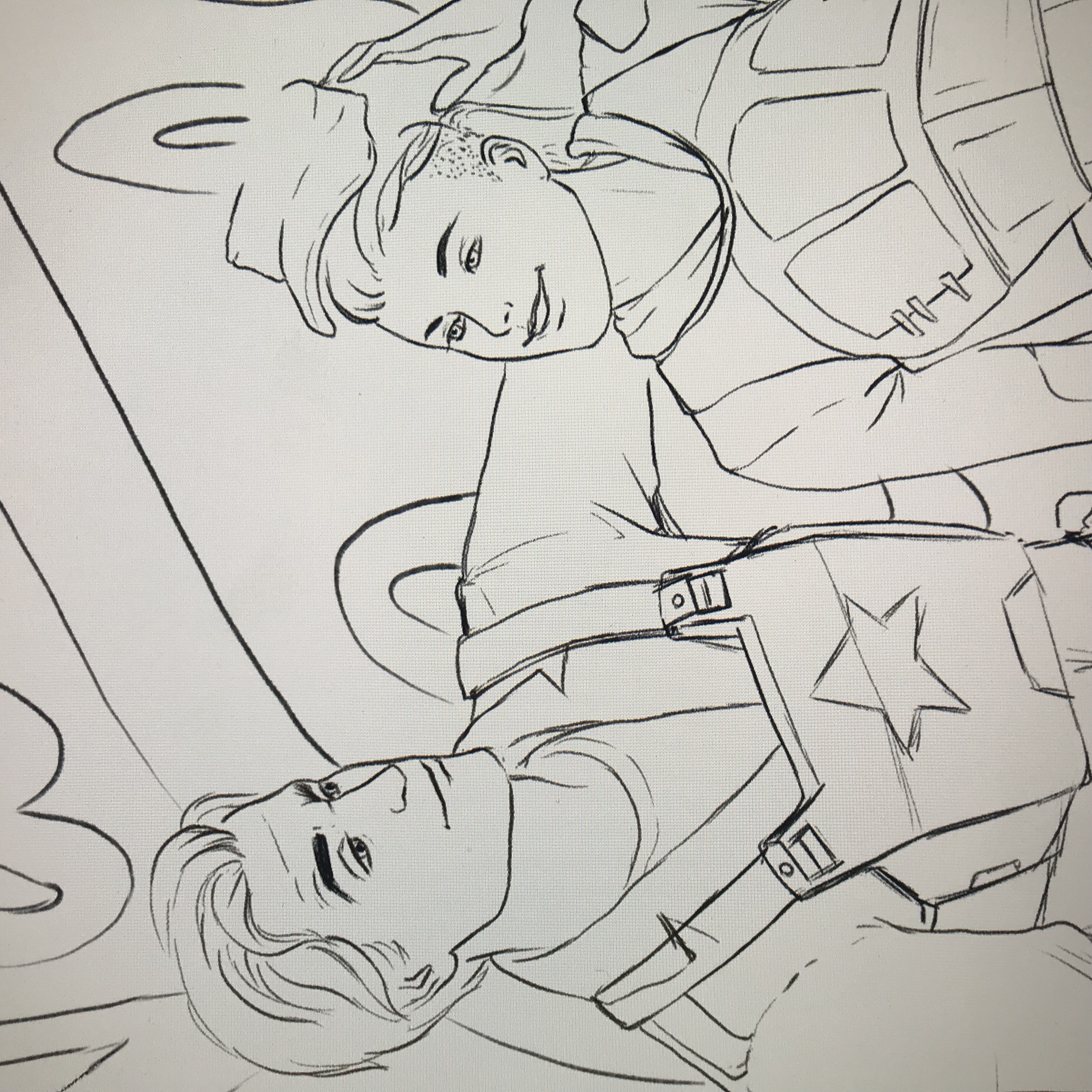
This is still in the very early stages. It’s going to be a watercolor piece but I want to make sure the faces are correct before transferring it to watercolor paper. They don’t quite feel right to me yet, so suggestions are welcome!


I don’t notice anything out of alignment with the faces, the centerline seems appropriate. Unless you are doing flat comic book color, you may wish to indicate some plane changes to indicate where the light is falling. Cheek bones, etc.
Thank you!!
The older face looks pretty great to me! The young boy’s face strikes me as a touch feminine; maybe the thin eyebrows and dark lash lines are playing in to that. But it’s looking great so far!
Thank you Abbi! I was going for tomboyish woman, so I guess that works? Lol