EASEL OF Aurore Folny
I am open to critique
I WOULD LIKE HELP WITH
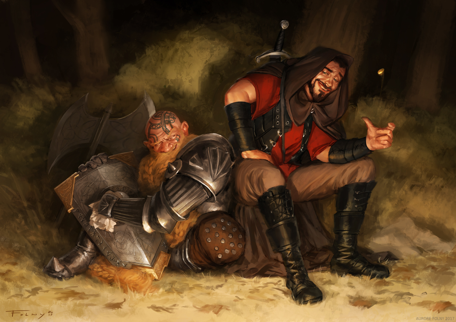
This is one of my best work, and I'd love to hear what I could improve ! I'm currently looking for effective and quick rendering for my background, and i'm struggling at painting textures. Maybe I should play more with brushes packs or look for traditionnal-looking digital rendering techniques ...


Well, as i do very little digital work, i can’t really speak about that aspect. It is a bit of a mystery what they are looking at and i assume he is supposed to be holding a glass or mug, There is nice clarity of emotion and characterization differential between the two characters…As for texture, things like the pants (on the fellow on right) look unfinished and the grass (or ground beneath their feet looks a bit more like fur than grass or ground. Hope that is useful even without the digital technical info.
This is delightful. There is enough light on the rounded center of the trees to show more detail there, even if they are background. And just a little selected detail in the grasses will be enough.
I love what you’ve got going on here. The looks on their faces tell me that there’s a story that I’d very much like to hear about. :3
There’s not much input I could give about this particular painting that hasn’t already been given. However, if you’re looking to try out some brush packs with more traditional media style functionality, you may want to check out Frenden’s stuff. I use his Pencil brush tool presets with Photoshop and they’ve even been helpful for touching up scanned pencil work. And since they mimic traditional media that well, you may be able to get the texture results you’re looking for.
I absolutely love this piece. It has so much character and life to it, the expressions are spot on. I love the texture. My minor issues is the coin the guy is flicking. It took me a moment to register what he was doing with his hand and finally realized he was flicking a coin. Not sure how that could translate more, perhaps more streak but in the hue of the greens in the back with a hint of gold? Not sure.. and the other thing that I’d suggest since its a night time setting is perhaps where the light source is coming from? Is there a fire crackling somewhere and if so should there be warm/orange highlights here and there and if so, should the light green above man in armor be a tad darker? But in all honesty, I love this piece and probably wouldn’t change a thing.