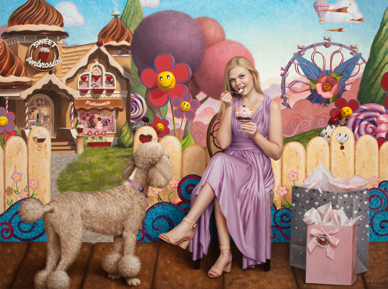
EASEL OF Beth Sistrunk
I am open to critique
I WOULD LIKE HELP WITH
I've never done one of these before so I'm not quite sure what to ask for in regards to a critique. My work is for the purposes of collection through a gallery. I want to be able to create works which connect with potential collectors on an emotional level. I do wish to improve upon the storytelling aspects of my work.


No critique at the moment, but just wanted to say this looks incredible!
Hey Dan,
Would it be possible to program the reply interface so that when you are replying, you can see the critique they left you? I think it may be very helpful. Thank you!
Thank you so much Dan! I really appreciate that!
As to composition, if the poodle doesn’t have to be it’s current color, a black poodle would stand out more. A black with subtle purple tones would tie in the other purples in the image and make the black less harsh.
As to storytelling, the title is a play on words. What other elements could you put in the image that would convey ‘Sunday’? When you think of the Sunday what comes to mind? For me it’s church and football, though I don’t attend the first or watch the second. So a steeple in the background? A football lying in the yard?Is there anything you associate with Sunday? This way you can play off both iterations, ‘Sundae’ and ‘Sunday.’
Good luck and nice job.
Thank you PainterX! I appreciate the feedback. That’s a great idea to pick up on some of the other aspects of the meaning of the words in the titles. I had a one track Candyland mind when creating it. I will be something I can use in the future for sure! I had also contemplated making the poodle a chocolate color and having the sidewalk be just a gray sidewalk and played around with these in photoshop. It definitely changed the focal points and I was literally a split 50/50 on which way I liked it most. A darker poodle I think would have been helpful. Thank you again! 🙂
I am also at a loss for critique on this piece! I’m just in awe of all the details and the fun-ness of it! I keep looking for Easter eggs. (Ha! I meant figuratively but literally could be fun too! Piggy backing off the “Sunday” concepts… Easter Sunday / Sundae!)
I am absolutely in love with all the little details and the mix between realism and stylization! I feel like I entered the game Candy Land, and I love it!
It is hard to critique such a honed piece with such a beautiful composition. I think Painter made a good suggest when it comes to perhaps, changing the poodle’s coat color, if it is a change you are okay with making. Right now the color of his fur makes him blend a little too closely into the fence behind him. Whereas the blue design along the fence really makes his coat pop. Might be something to play around with at the very least to find what will work best.
The only other small critique I can give right now would be the shadows on the realistic elements. The shopping bags, the female figure and the poodle all have shadows beneath them, but even if this is full sun, you’d have slightly sharper shadows beneath them. I think a strengthening of those shadows will make them pop off the page further.
I love your work though, I am definitely going to have to check out more!
I think its probably enough to deepen the darks slightly on the dog to get him to pop more. The overall light tone of the piece works perfectly for Candyland. If you would post a few more, we could better judge the way the series handles the storytelling component.