EASEL OF Danielle Neuman
I am open to critique
I WOULD LIKE HELP WITH
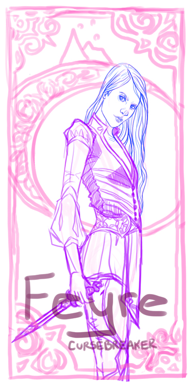
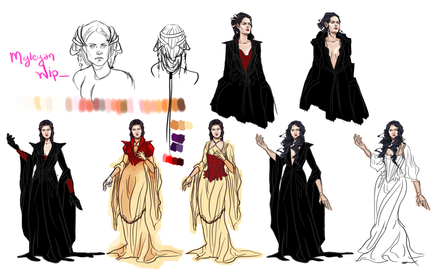
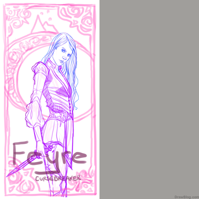
Looking for thoughts on all three of these pieces. #1, just looking for thoughts on direction and the current concept before I move on to larger scaling. #2 anything is fair game, specifically current placement of things. #3, help/advise on how to make things more neat and tidy with my character development sheets in PS would be super helpful, or even just ways you keep from being overwhelmed when working digitally. I just struggle with so much to manage and organize, I get lost and end up leaving things in this state. It is personal work, but I'd like to have better practices for the professional commissions I receive,


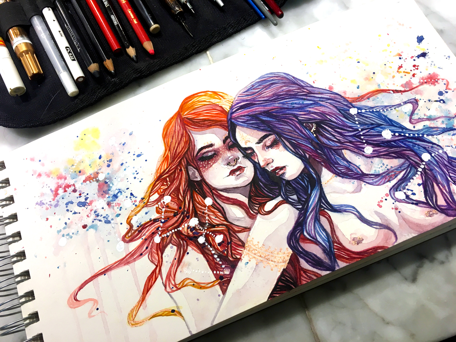
Looks great! This might look even more compelling on a background that isn’t the same color as their skin tone. That could bring out the constellation like thing and the gold bracelet.
Perhaps just bring them up and into the page a little more, and develop the background more.