EASEL OF JC Pool
I am open to critique
I WOULD LIKE HELP WITH
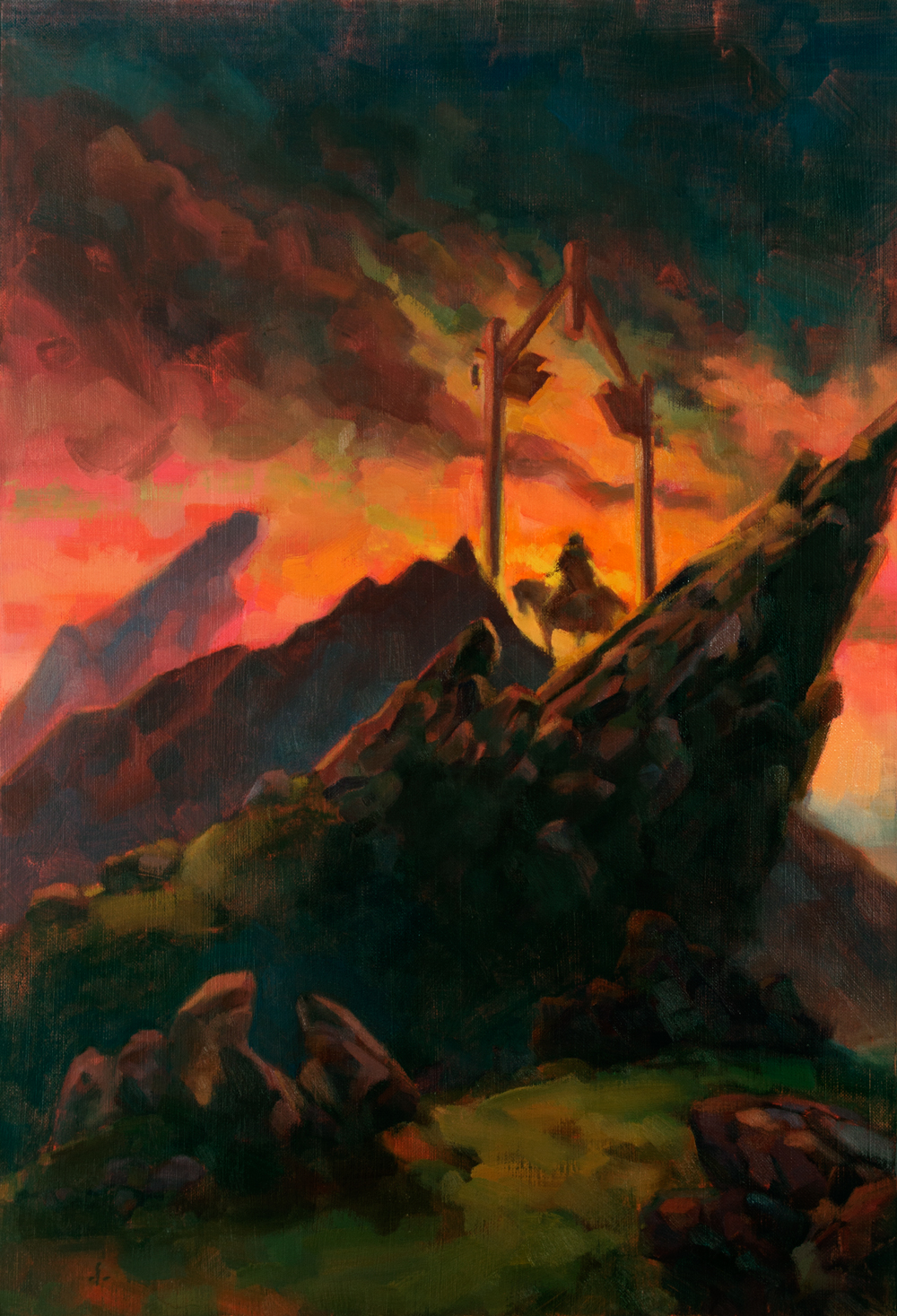
I did this painting a couple of months ago and it's been nagging at me since. I can't quite put my finger on it. I have suspicions about my values; is it too dark overall? Are the first ground, middle ground and background reading properly? I've looked at it and gone back and forth with modifications so much I can't really tell anymore. Any help would be greatly appreciated!


Hi JC,
Your area of highest contrast and saturation is obviously the sky, the area that is most distant. That is not a bad thing, as it frames your mid ground figure nicely. I would leave the middle ground dark, and bring a little more light into the foreground; the grassy areas, and the upper edge of the rock formation. You might try getting a little more of the pinks and yellows from the sky onto the grassy fields as reflected light. Also, you are at the stage where a little more attention to sharpened edges is warranted. particularly along the boulder edges, and here and there on the figure (not all over or he won’t sit in his space, but right now he is all fuzzy, and sharpening a few spots will help to keep attention on him, as it should be. Good luck!
Hi Marvin!
Thanks for your feedback! I agree with you on both points. Edges are definitely something I always struggle with!
BTW, I’m at table 16, come on by and leave a though or two.
I will most definitely!
I think the image reads very well! You have strong contrasts both in value and hue, and this captures the eye.
The only thing I would do to improve this is to add little sharp details to contrast the fuzzy overall atmosphere and catch the attention of the viewer (refine more the rider, for example, since I think he or she is the “focus” of the painting).
I really love that dark and undetailed area under the main boulder! It makes everything else pop up more. Your use of colors is spot on as well (great blue-vs-pink on the far peak on the left!)
Thanks for taking the time!
I totally agree on sharpening edges where it matters! I will mess around with that and post an update soon!
🙂
Thank you! It does read so much better that way!
Hi JC,
I read the critiques and I agree with them – I would sharpen the middle ground and the character to get focus, or blur the foreground even further so the rider pops out.
I am not sure how to read the rock that meets the left leg of the gate (the pointier one right under the orange clouds, the second one from the top and left), and I would suggest ensuring it stays with the layer it is intended for. For example, sharpen it a little to match the middle ground and the rider if it should go with them, or blur it further to merge with the background and make the gate pop.
Overall, great job, the colors are bold, vivid and dramatic, and I also like the diverse rock shapes.
–Kremena