EASEL OF Michaela Burr
I am open to critique
I WOULD LIKE HELP WITH
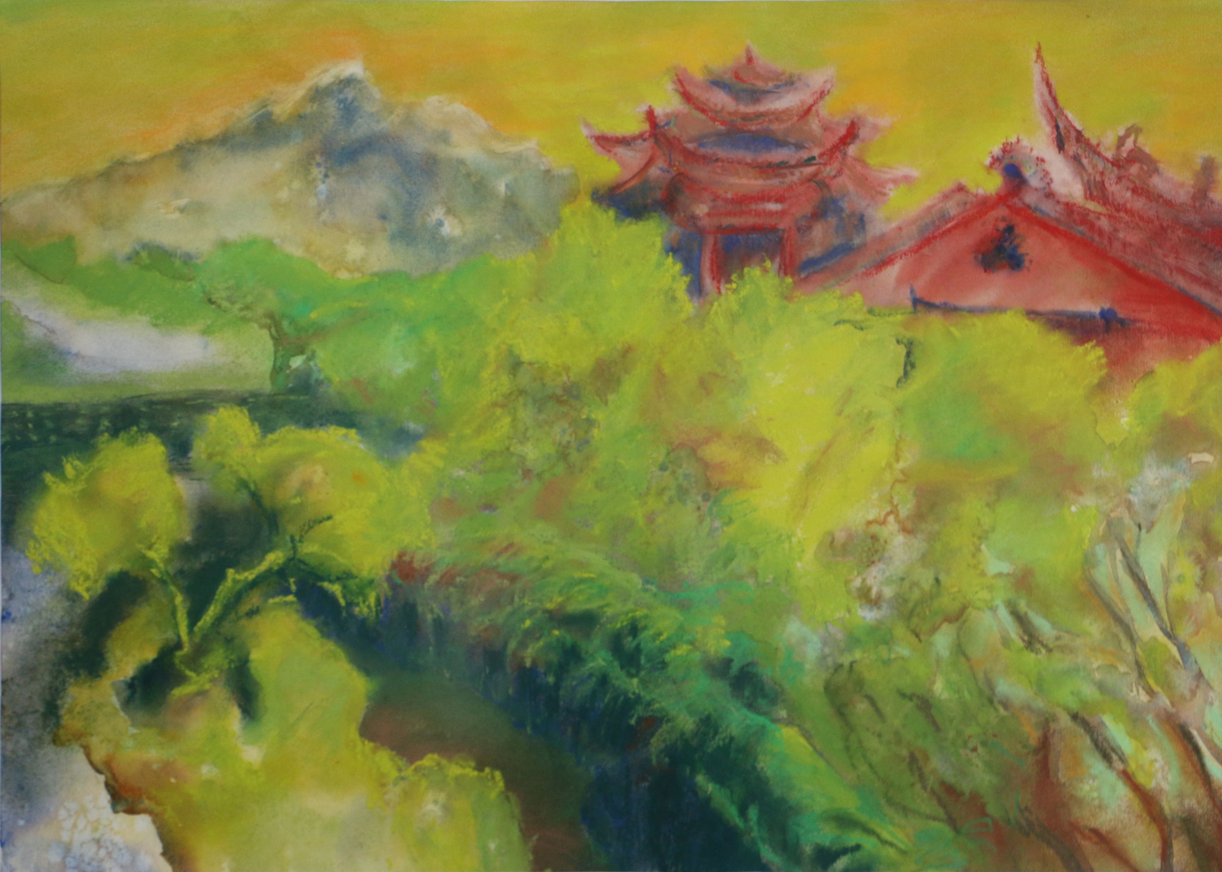
I simplified the colour scheme to yellow-green, red, with hints of blue - but isn't it too much? My goal was not necessary a realistic approach. What I wanted was to capture brightness of a sunny day.
Thanks for any feedback.
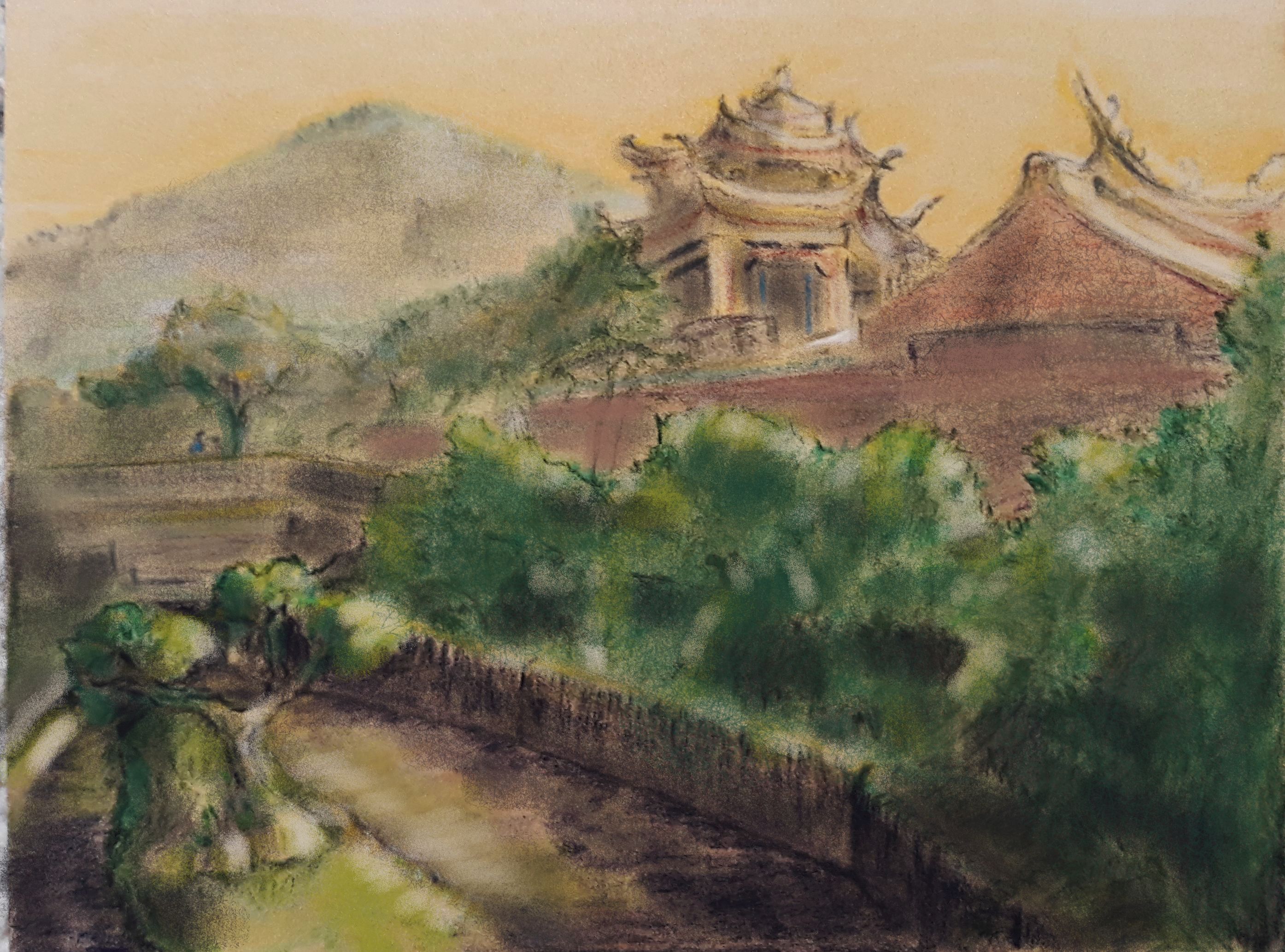
Update: A new preparational sketch based on your comments guys. I tried to separate the background, middleground and foreground with a better value structure. And use less saturated colours. Would be happy for your feedback.


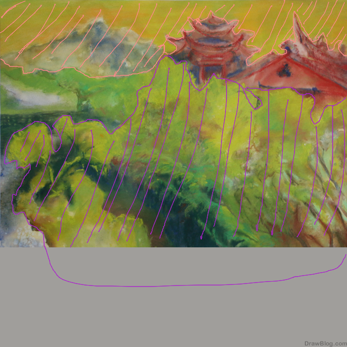
Nice. I wouldn’t mind seeing that foreground tree get a little larger and wrap around to push back against the strong diagonal lines pushing into the left side. The mountain provides a little counter thrust.