EASEL OF Nick Jizba
I am open to critique
I WOULD LIKE HELP WITH
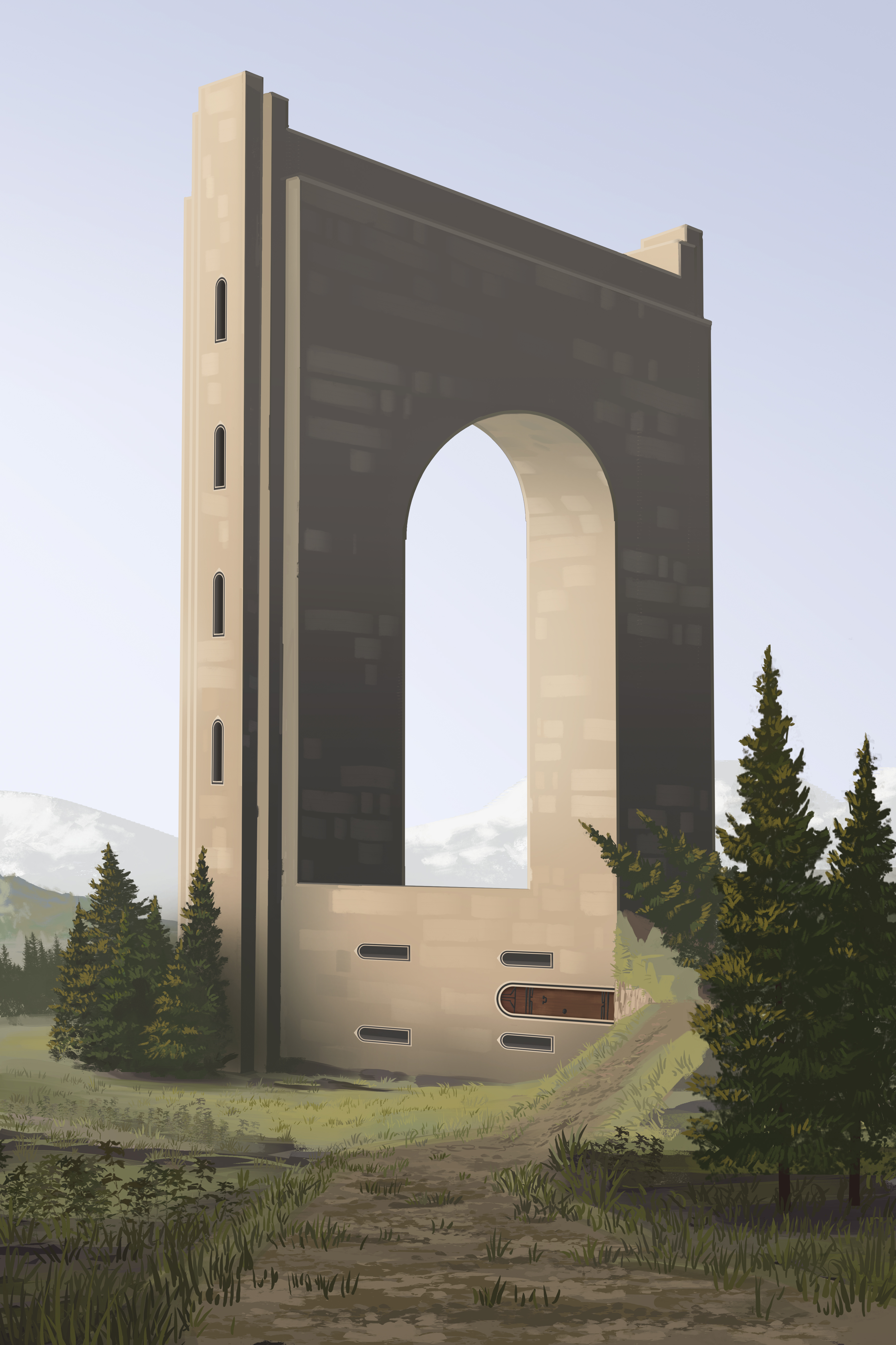
I'm reworking an older piece and I'm having trouble nailing down whats wrong with it. I think its mostly a matter of fixing things in perspective, but the intentional optical illusion is really throwing me off. (I also need to find some better reference than what I used at the time, especially for the building.)


Hey Nick, not at your table but I read your question and figured I might as well chime in. I think the biggest problem your perspective’s having is that it’s a really simple 2-point one. Try adding a third point in the vertical direction and you’ll notice things will become a lot more dynamic. Especially if your aim is to make the structure feel tall (and considering your canvas is vertical I’m assuming that’s the idea.) Google Richard Wright (the MtG artist) for reference, he’s an absolute master at that.
In addition I’d keep an eye on the relative scale of details too, the bigger stones in the tower start breaking the scale a little. Instead of those I’d opt to make your design a bit more interesting by adding a few protrusions and details that break the contours of the structure instead. They’ll not only help to make your design feel more interesting but if done right they can push the Escher-idea a lot more too.
Thanks! I’m also worried about the scale of the doors. I’m not sure its right.
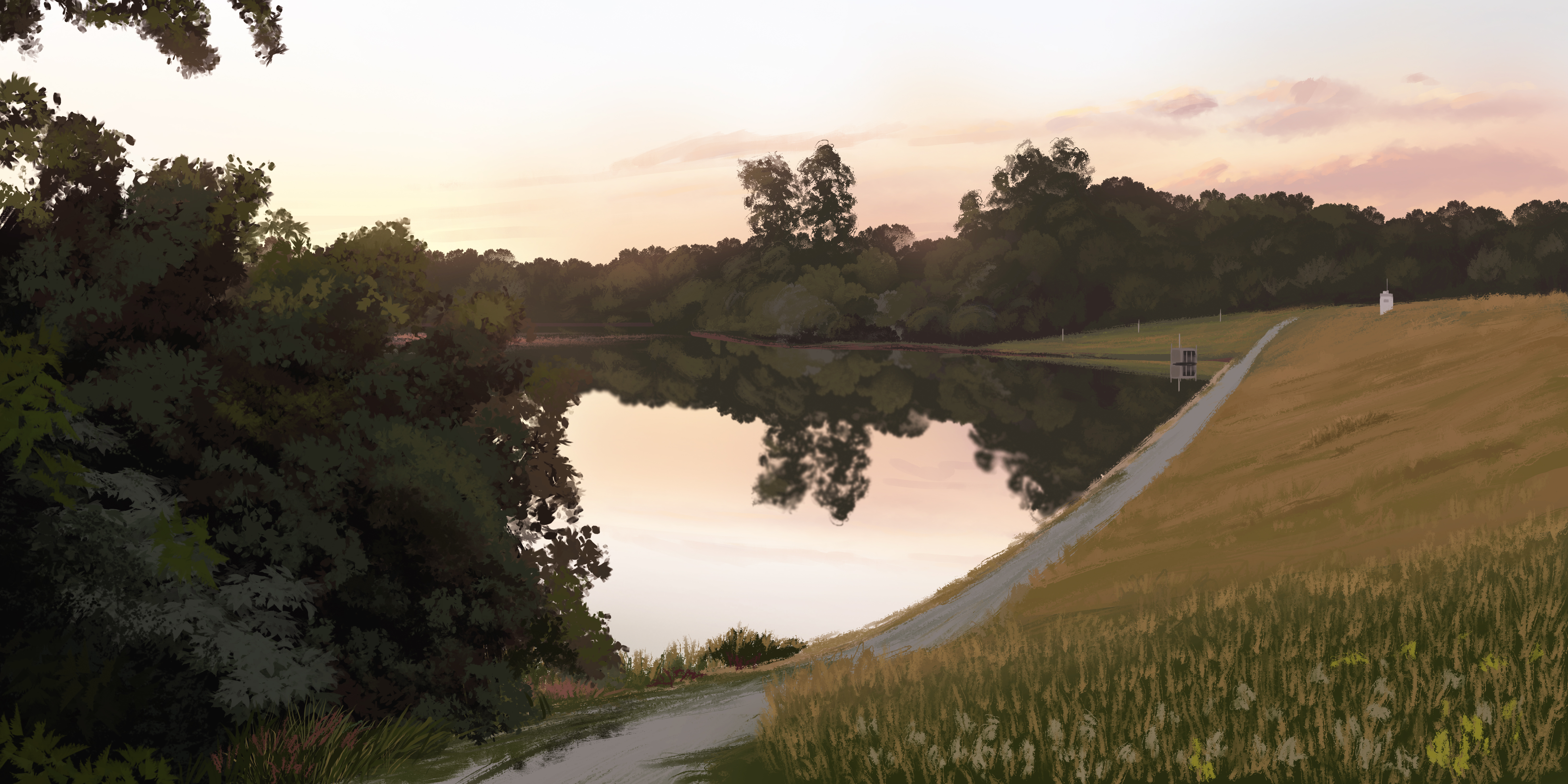
Hi there, I think your structure needs some more natural feeling in it. Your study shows some brushstrokes and shows off a realism and impressionism but your tower piece lacks a good light and your structure needs more natural details and lighting/ colour. I would reference castle and such to get a more natural feel. You have the trees around it but the building really doesn’t mesh with that aesthetic. It seems more sci fi right now. I would try casting a shadow over some of the tower and leave other parts more lit.