EASEL OF Robert Shingler
3
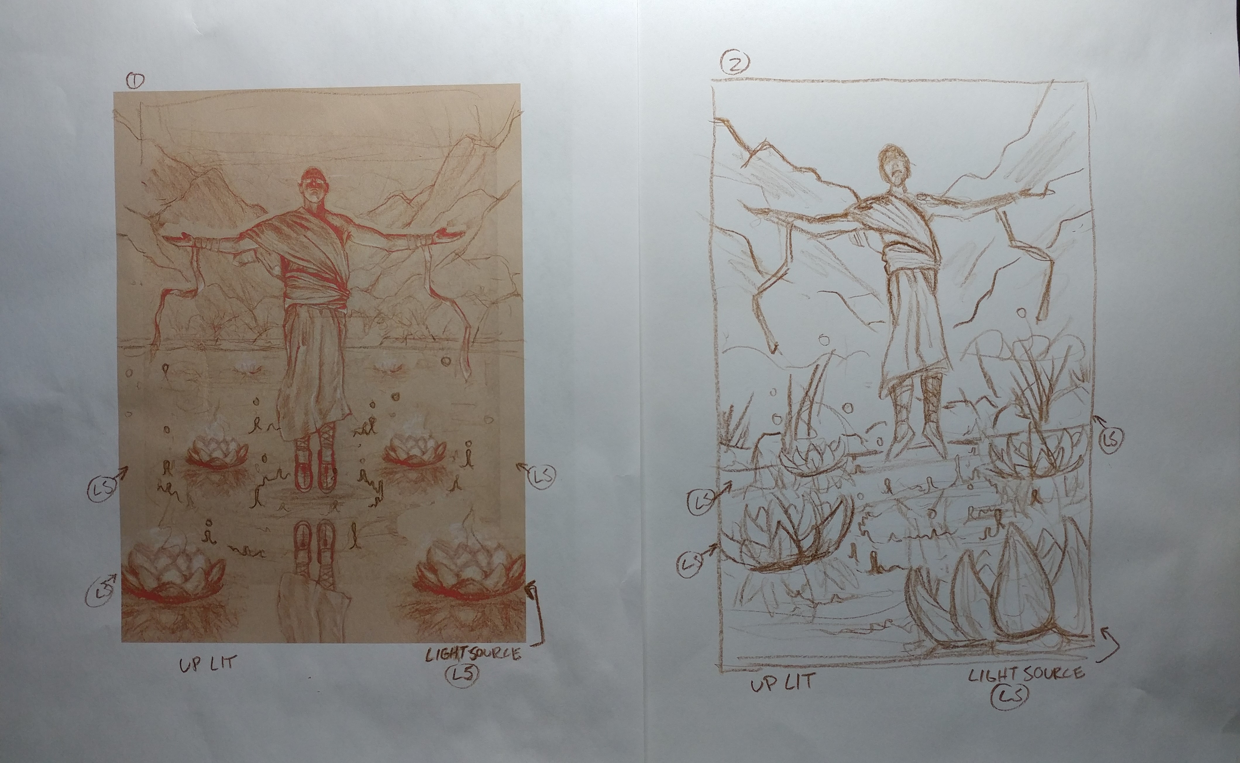
ok, so I was refining the first sketch and had the idea of a slightly different perspective. hence the second sketch. I know the second sketch is more dynamic but I am still drawn to the first. I am going for a meditation feel with a slight sense of power. I can't seem to decide on one or the other.
You must be logged in to critique
CRITFeedback for Image 3
2
I seem to be having problems with my scans not turning out quite right. Am strongly considering photographing my work instead.
You must be logged in to critique
CRITFeedback for Image 2
-
 KylePattersonIllustration on August 9, 2018 at 12:33 am
-
 KylePattersonIllustration on August 9, 2018 at 12:34 am
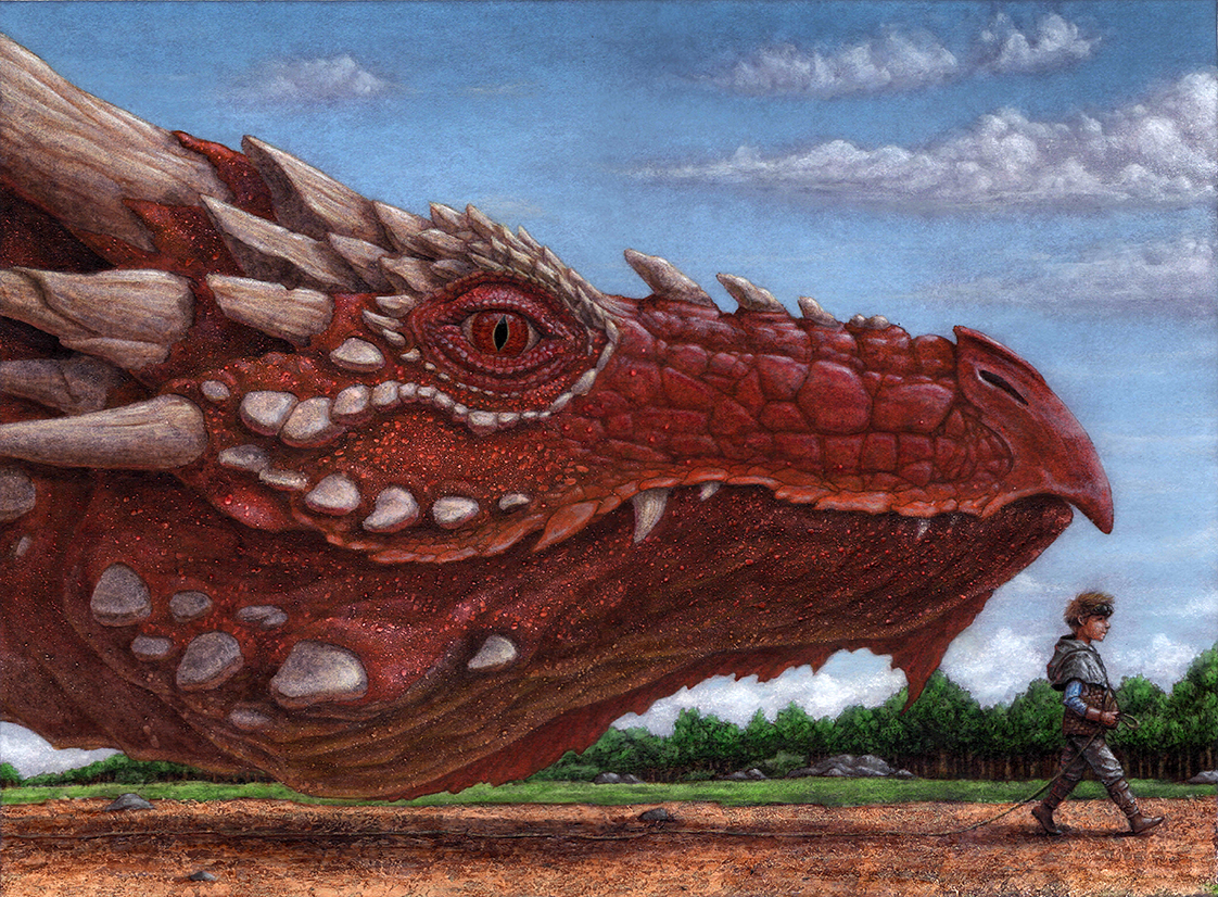
*attention-grabbing little highlight
Log in to Reply
-
-
 RachelPerciphone on August 9, 2018 at 9:22 am
Once again, I think this is a great piece full of character! My favorite part is the leash! I agree with Kyle about the stronger highlight on the Dragon’s eye.
Log in to Reply
1
You must be logged in to critique
CRITFeedback for Image 1
-
 KylePattersonIllustration on August 2, 2018 at 8:02 pm
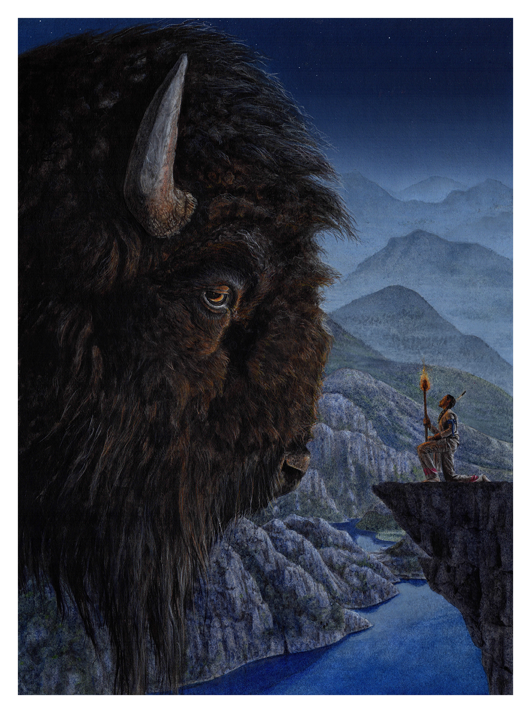
Holy Moses, Robert, this is stunning! Great use of texture, and a nice color palette. I only have a couple small critiques. 1.) I think it might help for the fire to be a bit brighter. I’m not sure if this is watercolor or gouache, but using some white gouache might help. Right now it doesn’t look like the flames themselves are bright enough to be giving off the amount of light that they are. Then it would really draw your attention to the interaction between the buffalo and the figure. Next, I feel like some of the reflections in the water of the closer landmasses might need to stretch downward a bit more. I’m completely guessing on this one though, and maybe you have some reference photos that say otherwise.
I really love this piece and would love to see more of your work!
Log in to Reply-
rshingler on August 4, 2018 at 5:05 pm
thank you for you time and critique. seems like there is an overall agreement about the intensity on the light source. thanks again.
P.S. really like your drawings. will try and leave some comments soon.
Log in to Reply
-
-
 RachelPerciphone on August 3, 2018 at 11:52 am
I am greatly enjoying that gorgeous texture!!! My boyfriend’s favorite animal is the bison, so I will have to show him this. Aside from the texture, I also love the graphic shapes of the mountains and the lovely atmospheric gradient! My only suggestion is the same as what’s already been said: I think the flame could be a bit brighter. Wonderful piece!
Log in to Reply-
rshingler on August 4, 2018 at 5:06 pm
thank you very much
Log in to Reply
-
-
 mpMann on August 4, 2018 at 12:00 pm
I agree. Heighten the light of the torch and its reflections on the figure to help draw the eye to him. He’s as important as the bison, but because of the size differential, needs a bit more fire color to hold his own.
Log in to Reply-
rshingler on August 4, 2018 at 5:09 pm
thank you very much. looks like everyone agrees
Log in to Reply
-
Robert Shingler
Working to build a professional portfolio with a focus on fantasy art.
I am open to critique
I WOULD LIKE HELP WITH
wanted to get something up here. critiques always welcome. looking to improve in order to produce a professional quality portfolio.
Thank you for your TIME!!!


Hi again, Robert. Wow! That really hits you. Again, you are really great at capturing texture, and the mass and presence of the dragon are really striking! I also really like the bit of reflected light on the underside of the dragon’s head, and the kid has a lot of character. My critique for this one is actually very similar to the other painting. I think the dragon would really benefit from a bright, glossy highlight in the eye. There is a bit of reflection as is, but I think an attention-little highlight would not only add an extra spark of life to the dragon, but it would help offset the really masterful rough texture of the dragon and the ground with something smooth and wet.
(also, I too have had a lot of trouble scanning pieces. I ALWAYS have to heavily photoshop the digital file to get it to look even close to the original. Don’t think there’s a great way around it)